We bring you the best new typeface designs every month, and every December, we round up our favorites; this year, we’ve been spoiled for choice. 2023 has delivered several type trends: sans serifs have leaned towards grotesques, display type has been bold and expressive, and there has been a very welcome Art Nouveau revival.
These are our picks for the best 30 fonts of 2023. Enjoy!
Mint Grotesk
A quirky sans with extensive options for demanding type treatments, including tabular figures. Mint Grotesk is an excellent choice for complex UI design.
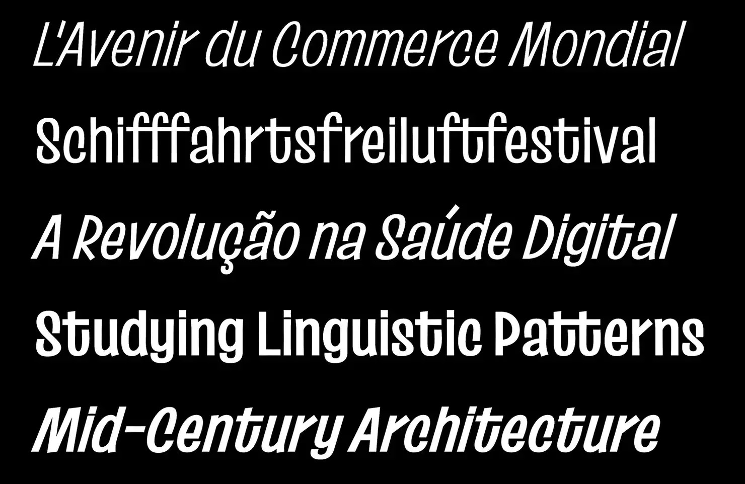
MC Belotra
We love the graceful curves and modest serifs of MC Belotra . The relatively low contrast and flared strokes are both confident and relaxed. A great mood-setter.
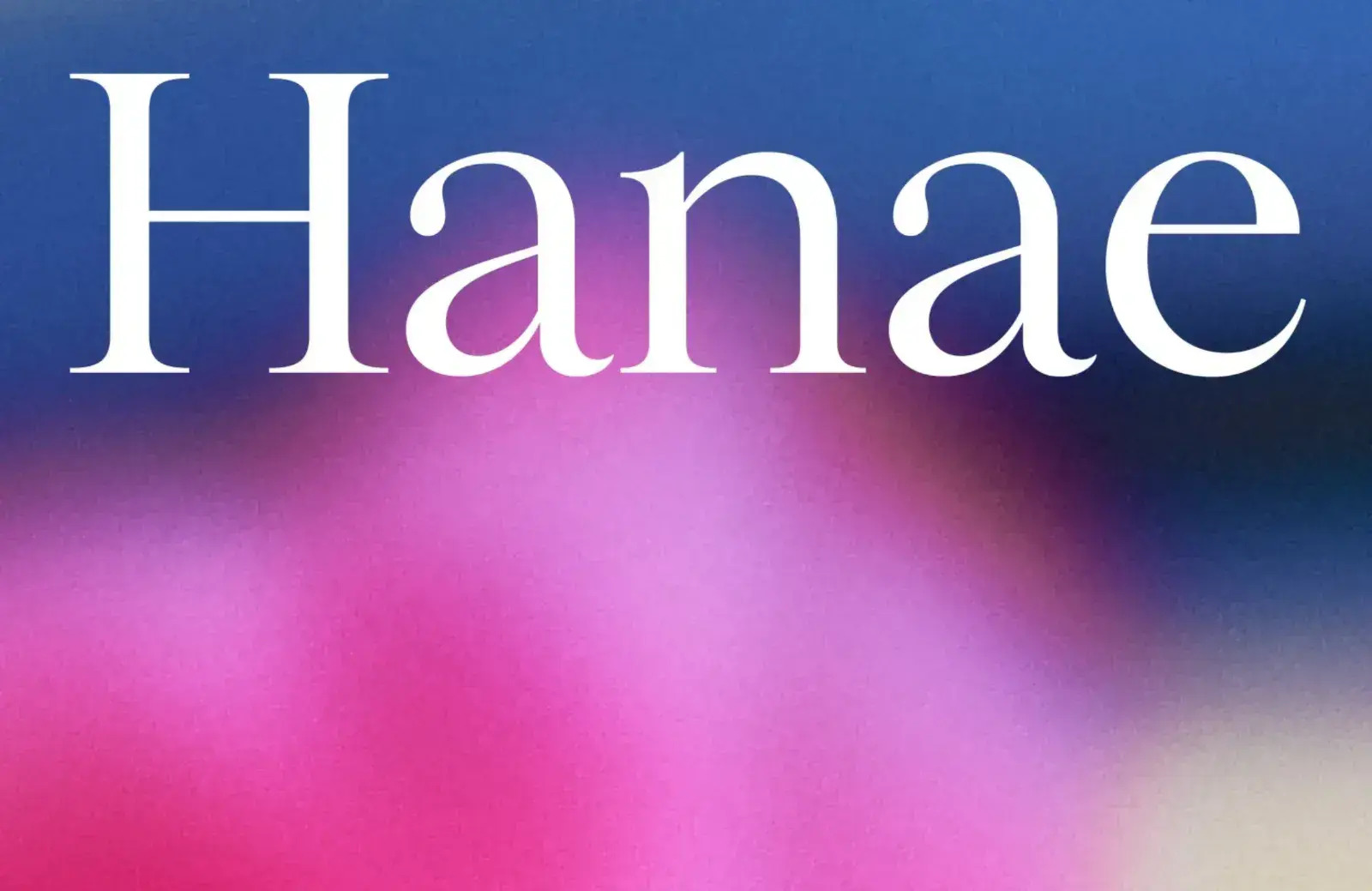
Hanae
Hanae — named for Hanae Mori, the first Asian woman to join a Parisian Haute Couture house — has a generous x-height and classic proportions, making it ideal for running text. Bold and Super weights have been added since we first admired it.
AW Conqueror Stincilla
We were already fans of AW Conqueror, and when we saw AW Conqueror Stincilla , it was love at first sight. The stencil form and sharp terminals are ideal for luxury branding.
Korium
Korium is an attractive variable font with extremely condensed glyphs. The soft and inviting outward forms are tight and sharp on the inside, creating an edgy contemporary sans.
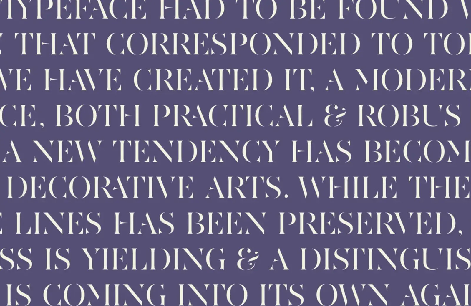
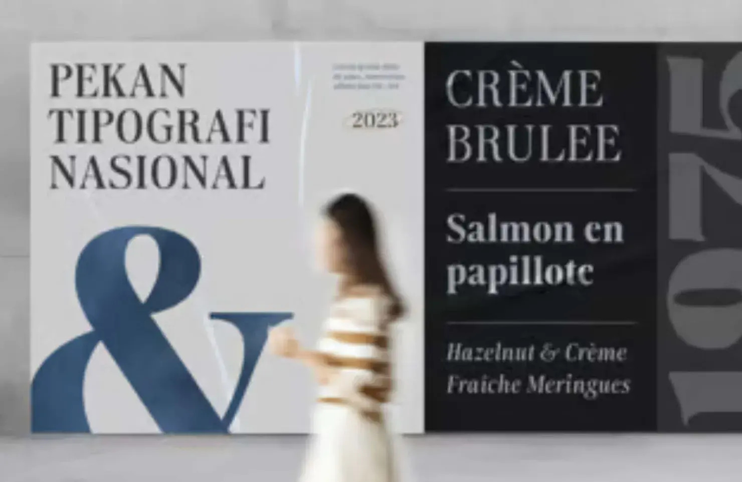
Kolonia
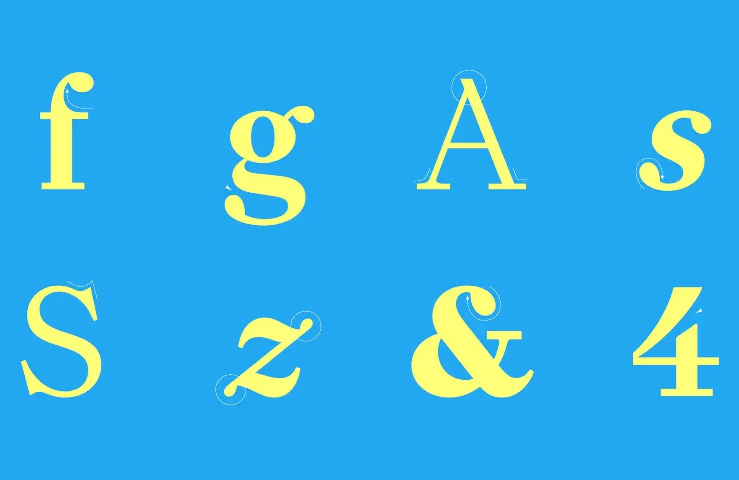
We still haven’t got over the confidence of Kolonia’s lowercase g. This sophisticated serif has a hint of traditional print about it, but some lovely details are distinctly modern.
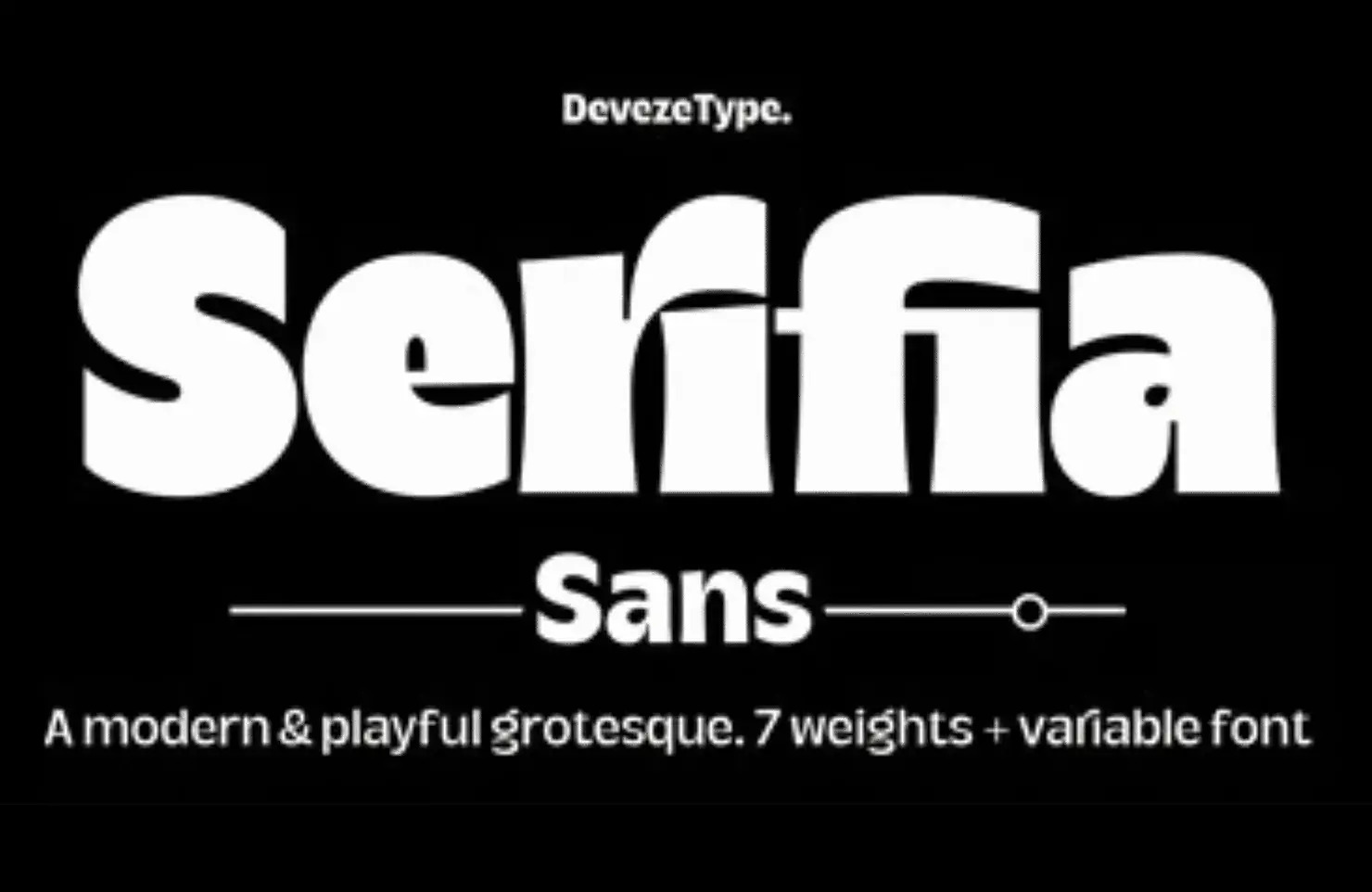
DT Serifia Sans
Another grotesque, this time with flared strokes that almost pop into serifs in the bolder weights. DT Serifia Sans is virtually cartoonish and is an excellent option for displaying text.
Valpo
Exploring the difference between type and lettering, Valpo feels like it’s been drawn with a fat marker. It’s perfect for vintage signage, and we’re still waiting to see it as part of a graphic novel.
Gamuth
Gamuth is an excellent choice for bold, confident editorial design, with a narrow width and large x-height. It has two versions: text and display.
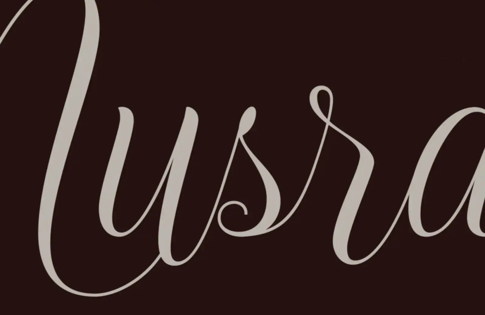
Nusrat
Nusrat has been painstakingly constructed around linked strokes to mimic calligraphy. The font market is crowded with scripts, but Nusrat delivers something new.
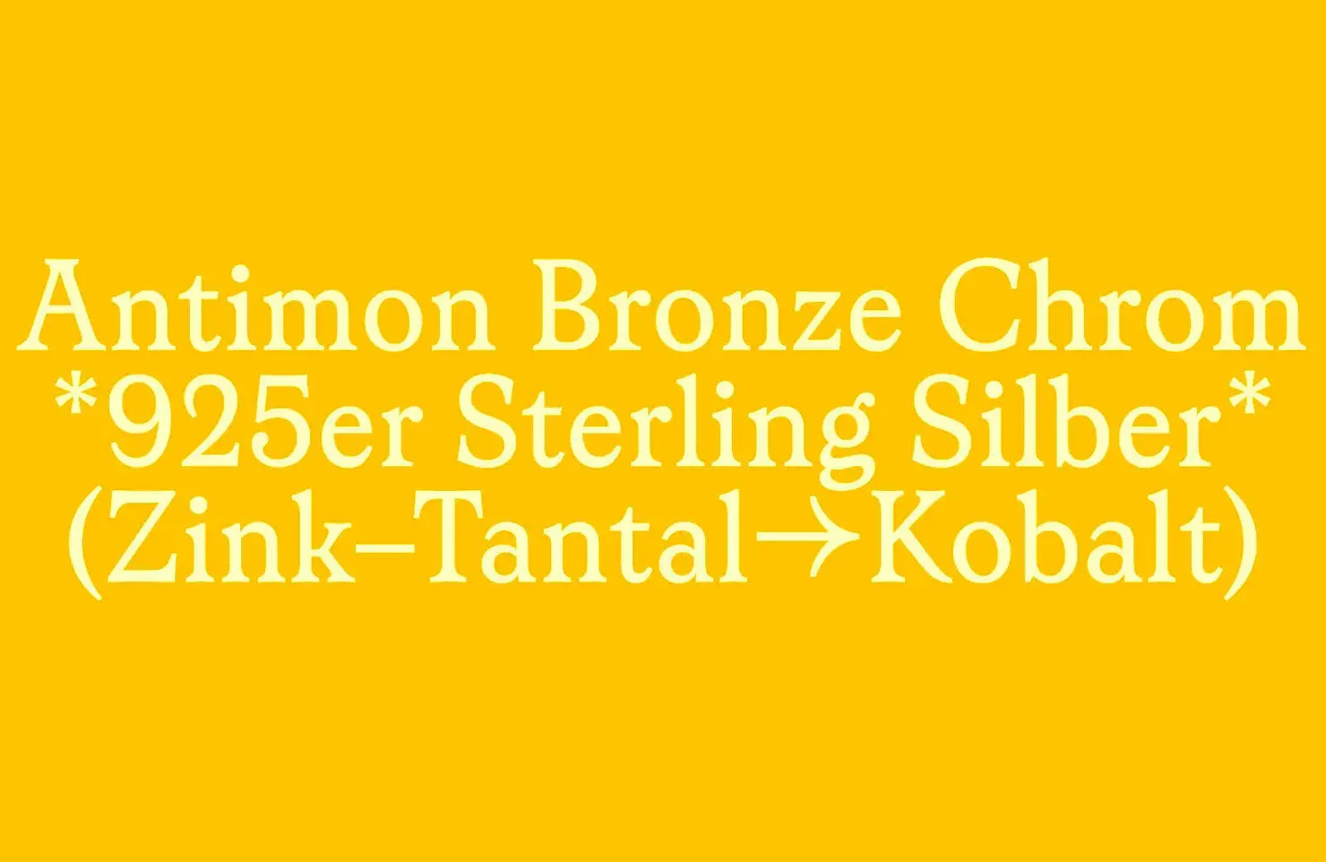
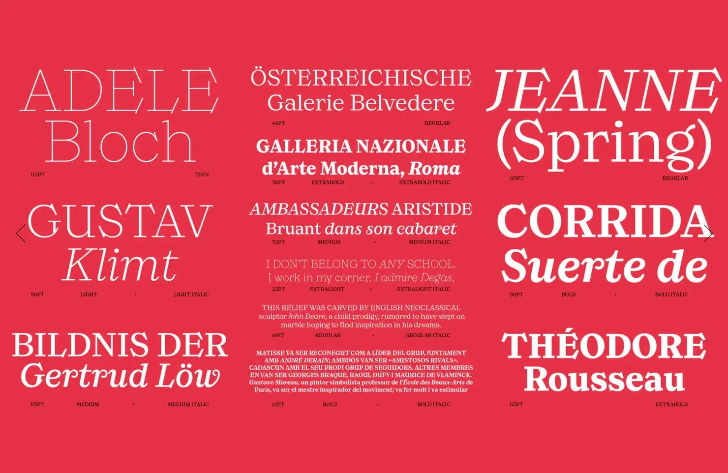
Martina Plantijn
Named for the 17th-century printer, Martina Plantijn is a beautiful Old Style serif that is understated at small sizes and features elegant curves at larger sizes.
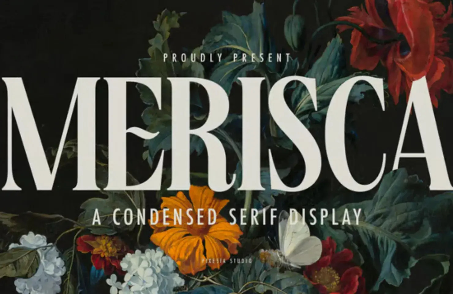
Merisca
Merisca is a condensed serif that we’d like to see used in a branding project. We particularly loved the alternate designs that bring the shapes to life.
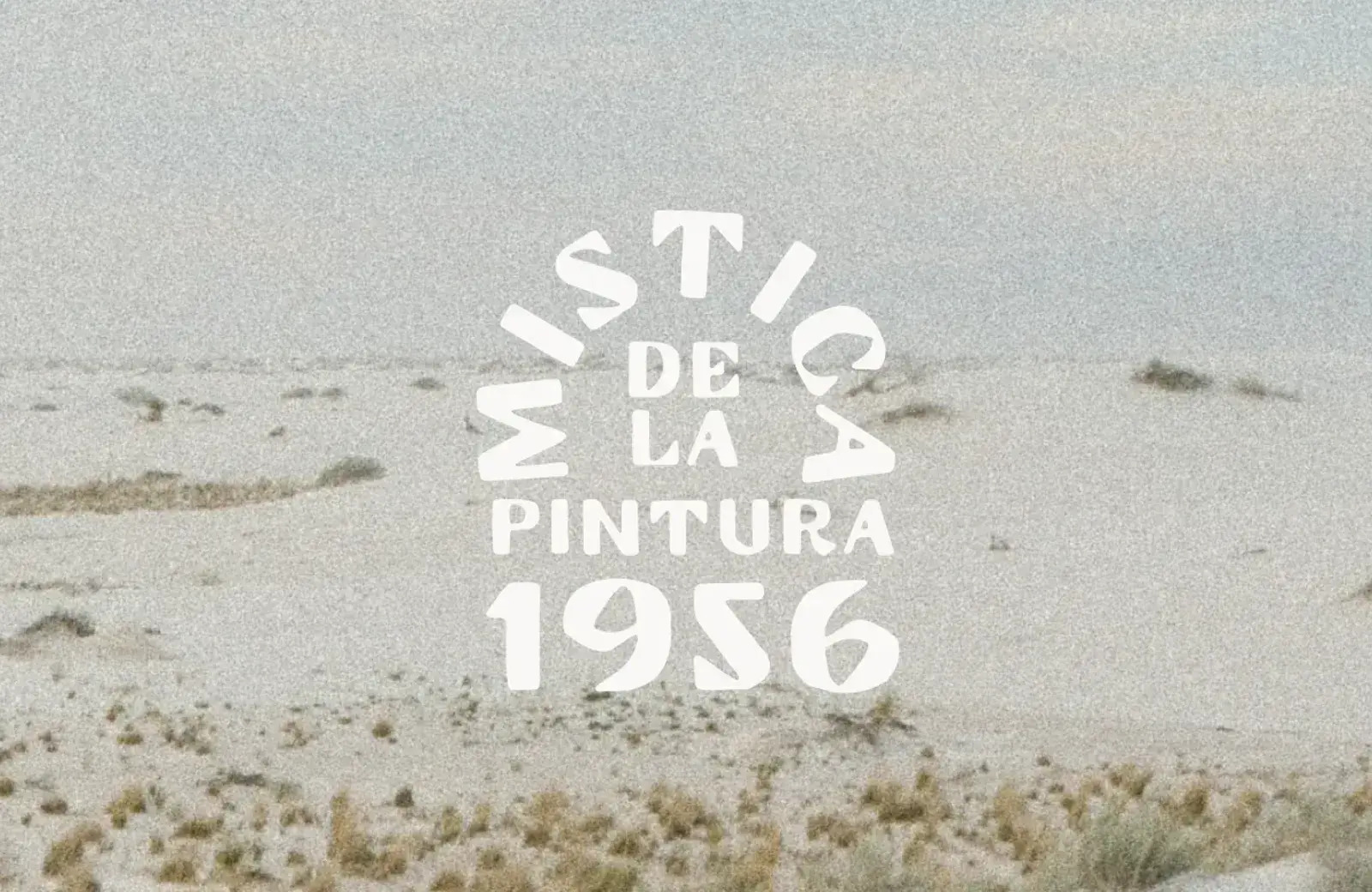
Mistica
We see a lot of all-caps display fonts that chase a vintage aesthetic, but Mistica is something special. Inspired by the South West United States, it would feel at home anywhere sun-baked.
Adjunct
The spurless design — the vertical strokes don’t extend beyond the bowl — of Adjunct creates a minimal, and graphically bold design that is ideal for logo jobs.
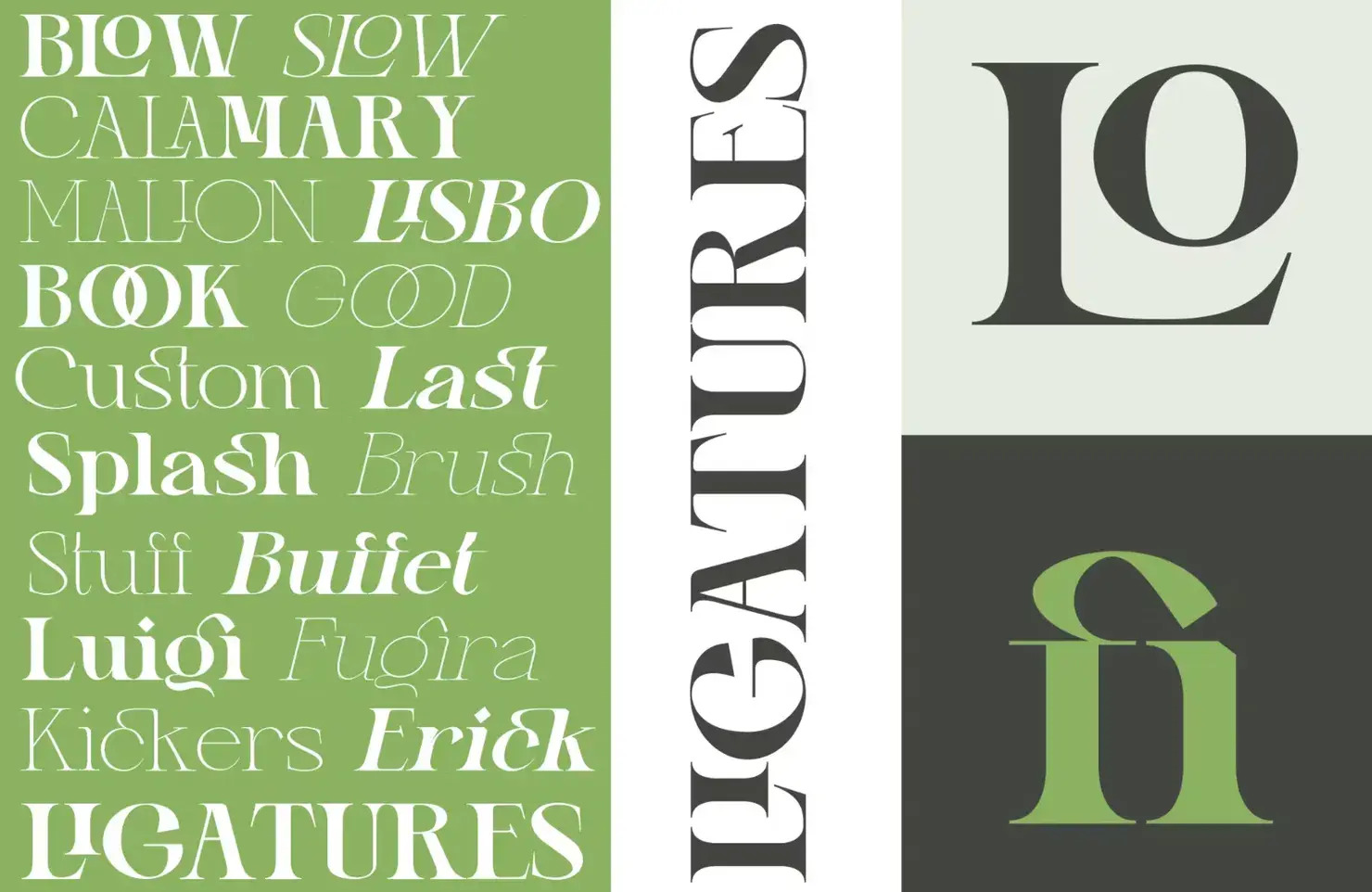
Gretha
Gretha is an excellent option for branding or display type when you can craft the letter combinations. It has a ton of ligatures and alternatives and feels very high-end.
Solfa
The heavy weight and bold graphical shapes of Solfa are great for grabbing attention at large sizes. It’s a rugged, confident typeface that complements the Brutalist trend.
Calleo
Calleo is a modern font family that is highly legible in small sizes and on screens. It has a more experimental “Flux” version that works well as a complementary heading font.
Publish Serif
Publish is a family of Gothic, Sans, and Serif fonts initially designed for the Danish newspaper “Dagen.” It’s a versatile set that works well for editorial design.
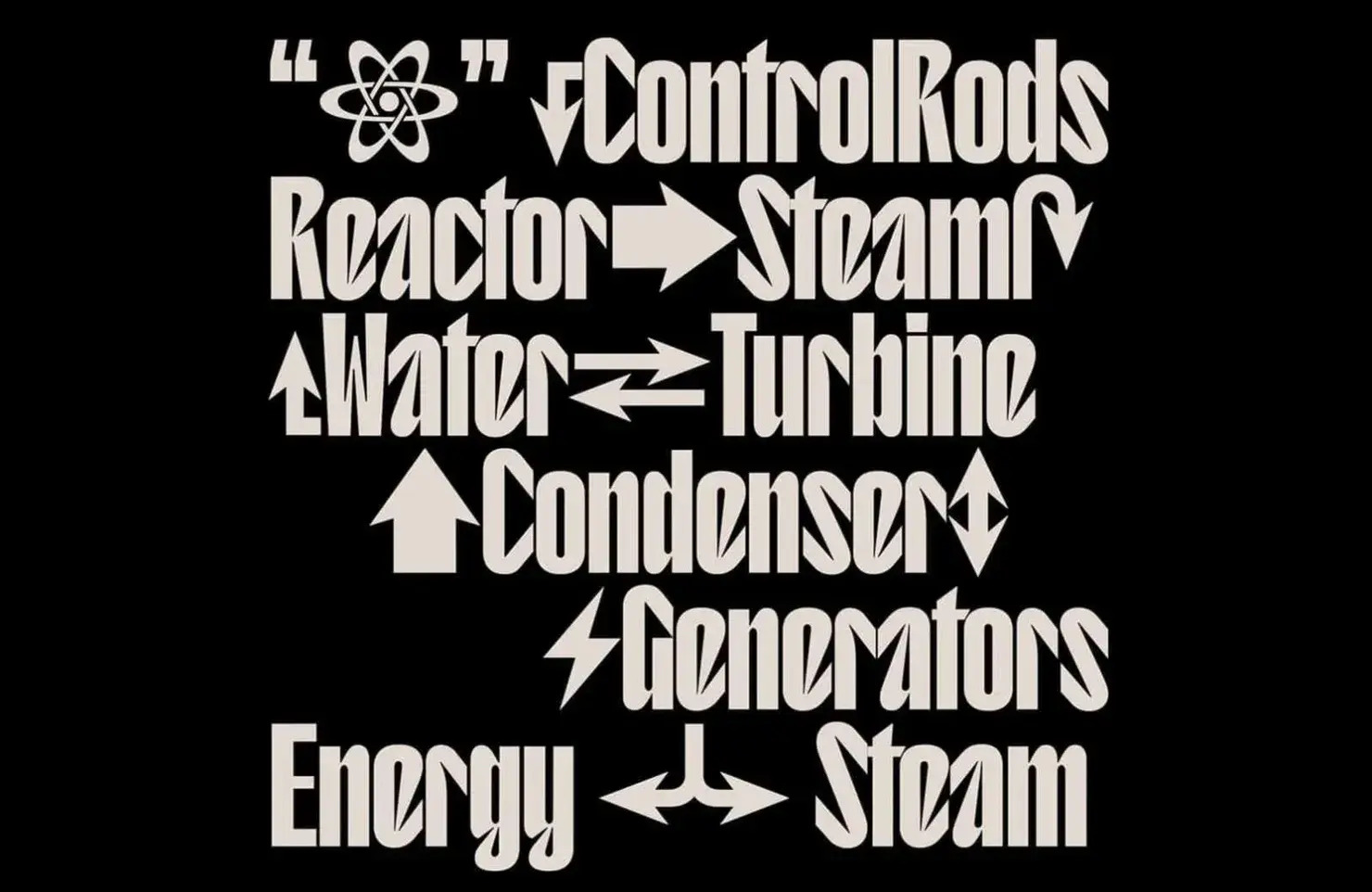
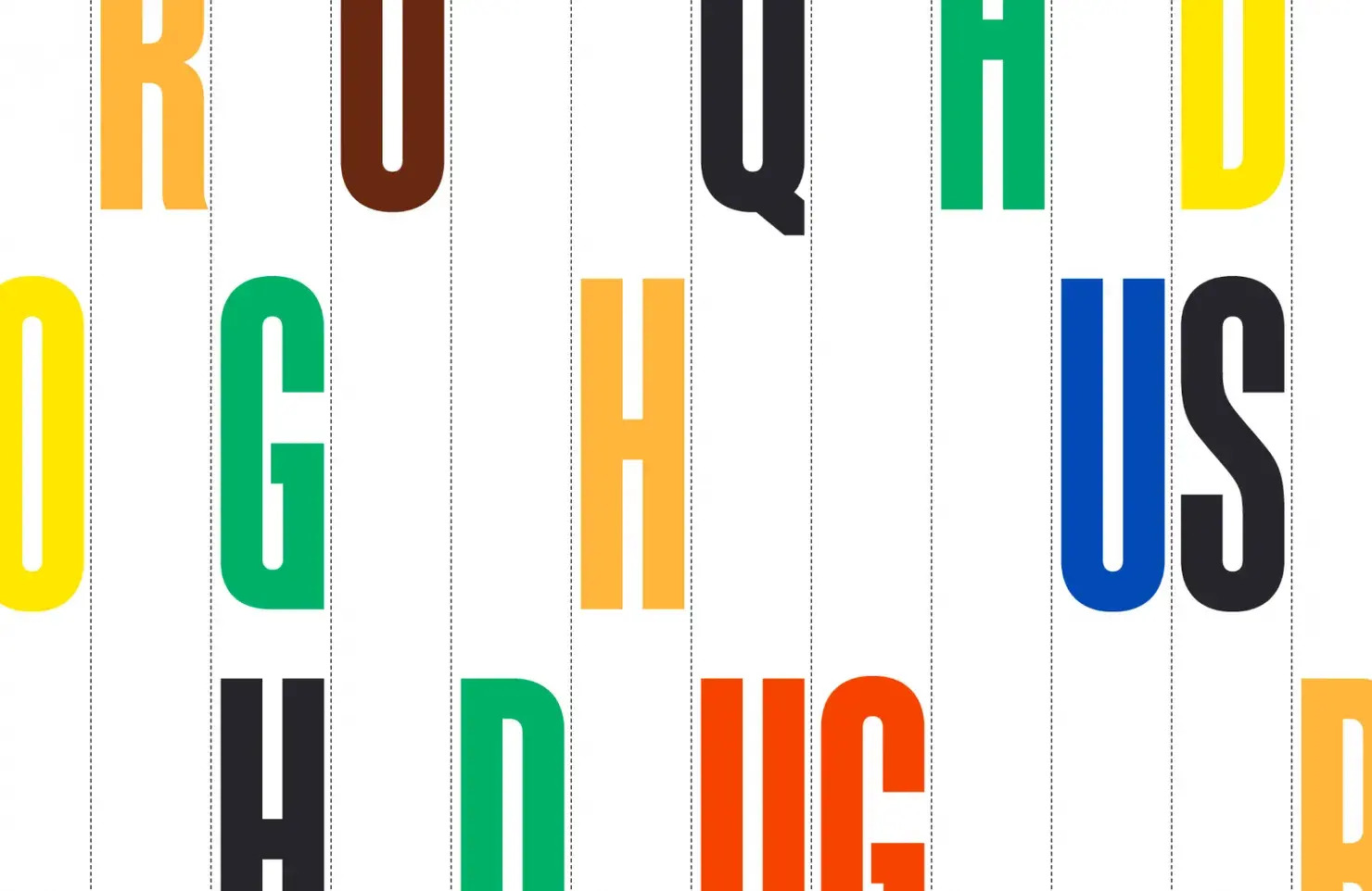
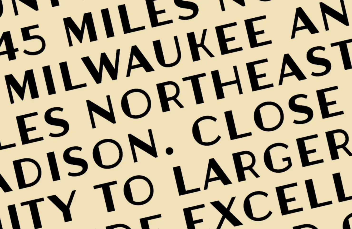
Juneau Deco
Juneau Deco is a beautiful example of an architectural type. It was created initially for the Stalwart Group, based on Art Deco lettering adorning its Wisconsin headquarters.
Moisette
Moisette sits at the mid-point between classic and modern type design. The high-contrast ratio and generous x-height are very legible. It’s ideal for any job that needs to feel expensive.
Ernst
Ernst is a stylish slab serif that works well for both running and display text. Its italics are particularly attractive and inspired by the lettering on mid-century Parisian movie theatres.
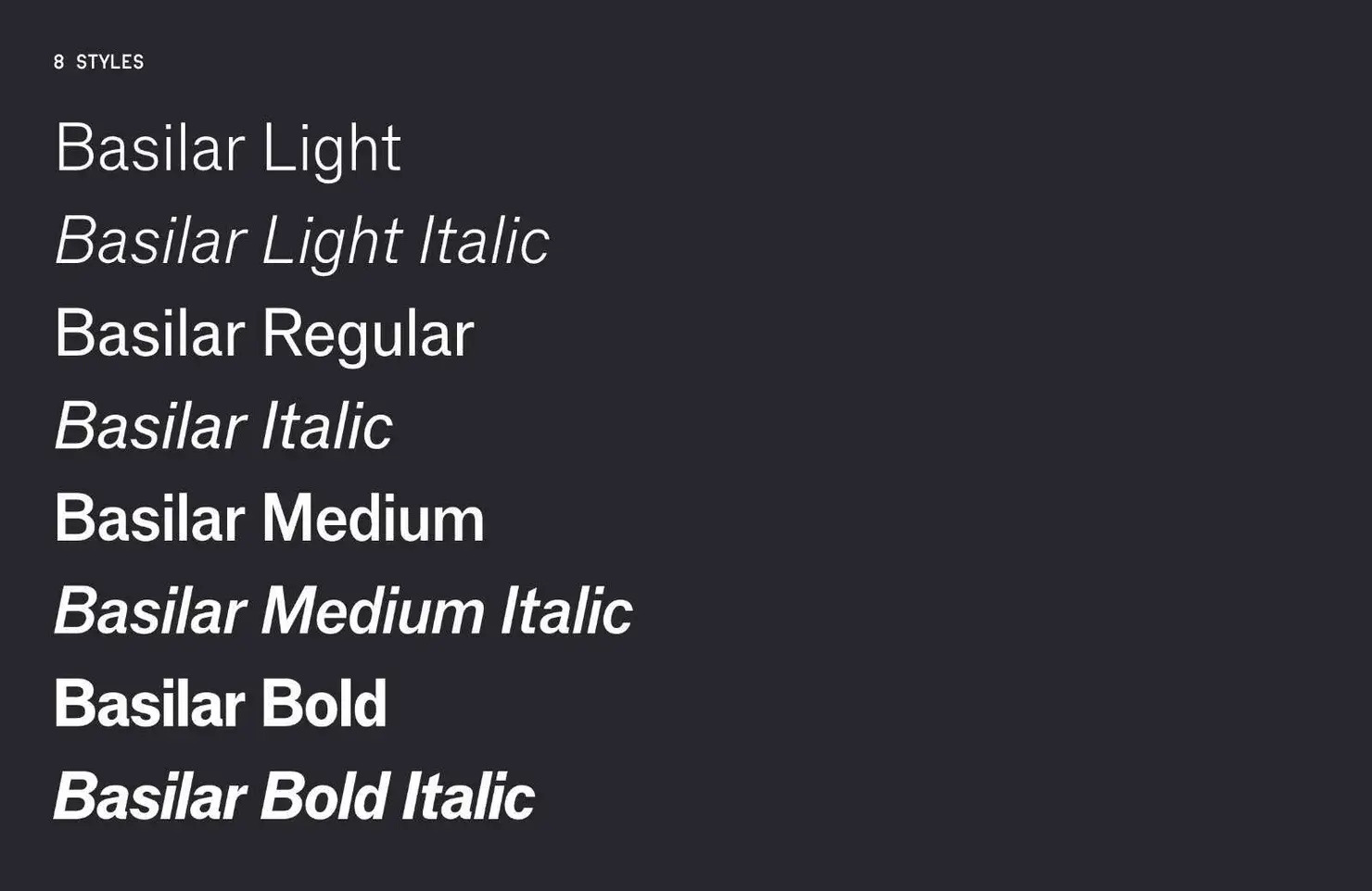
Basilar
Drawing inspiration from an early 20th-century German typeface, Basilar is less uniform and more Humanist sans serif than similar grotesques and adds warmth to designs.
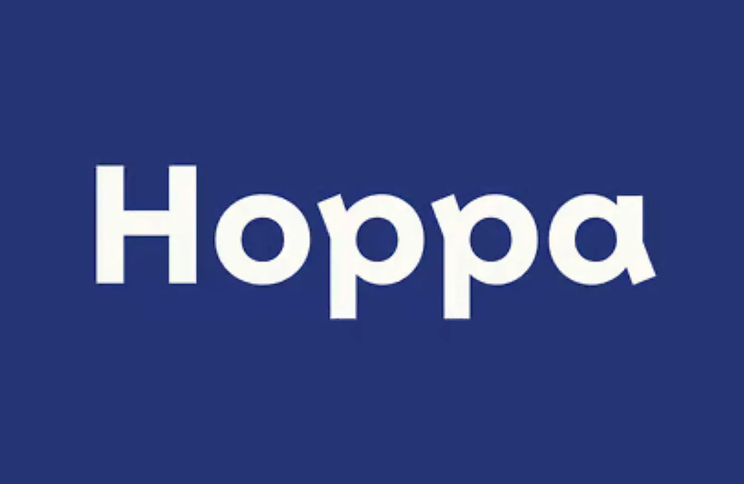
Hoppa
A distinctive loop stroke on glyphs with a bowl and stem gives Hoppa a playful, optimistic quality. The rest of the design is a simple geometric sans, keeping it usable.
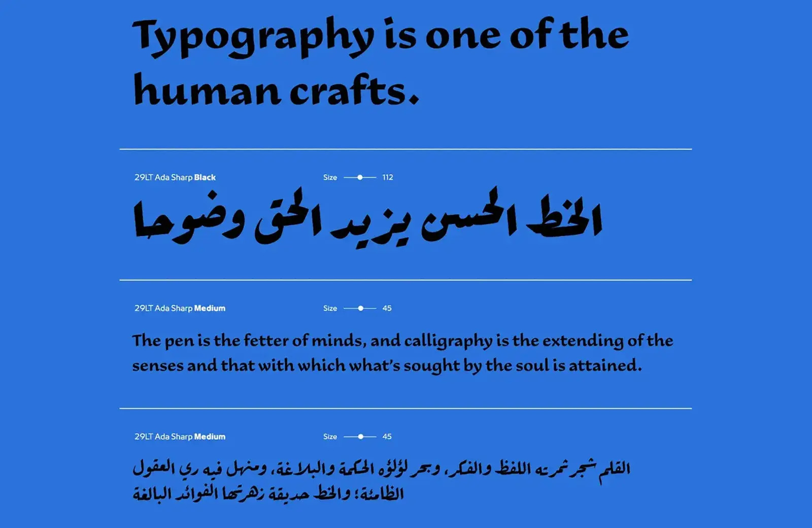
Ada
Ada has three variations: sharp, flat, and round. It’s a contemporary calligraphic typeface based on the Ruq’ah Arabic style and expertly blends Arabic and Latin forms.
Natri
Natri is a calligraphic typeface best used at display sizes. The consistent angled strokes create an engaging three-dimensional effect at larger sizes.
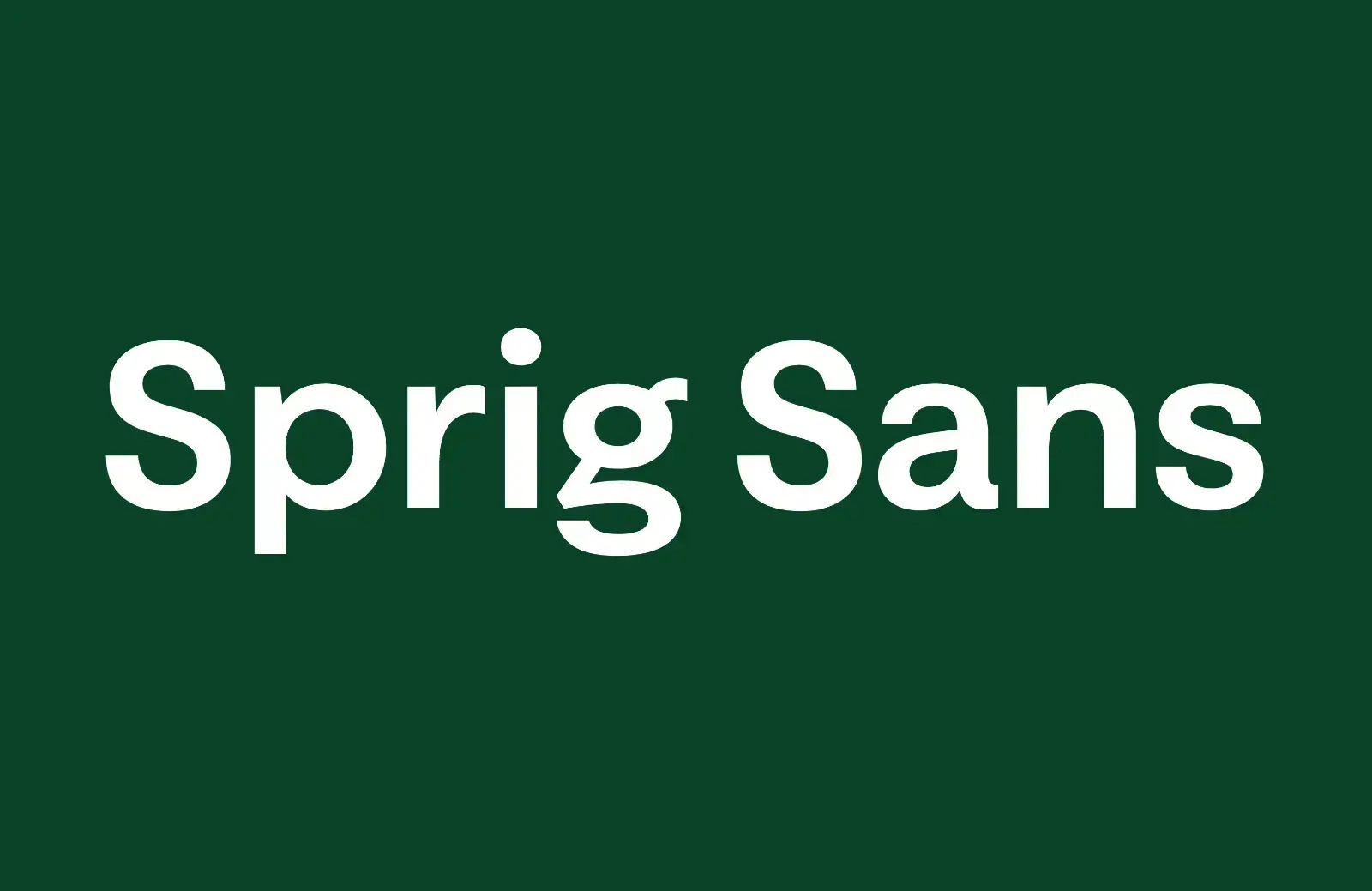
Sprig Sans
The Humanist qualities of Sprig Sans soften the strong geometric shapes, making it an approachable corporate brand face. There are multiple weights, a variable font, and a helpful companion serif.
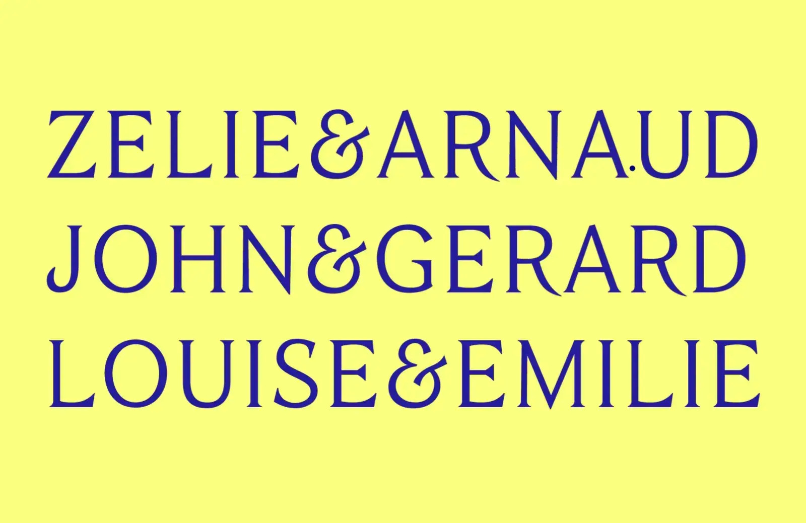
Tongari
Tongari is a serif font family with text and display variations, the latter employing increased contrast. It has a particularly attractive ampersand which makes it useful for logo design.
Atica
Atica is unapologetic about its construction. Inspired by early German grotesques, it’s a more interesting geometric sans than the typical corporate offering.
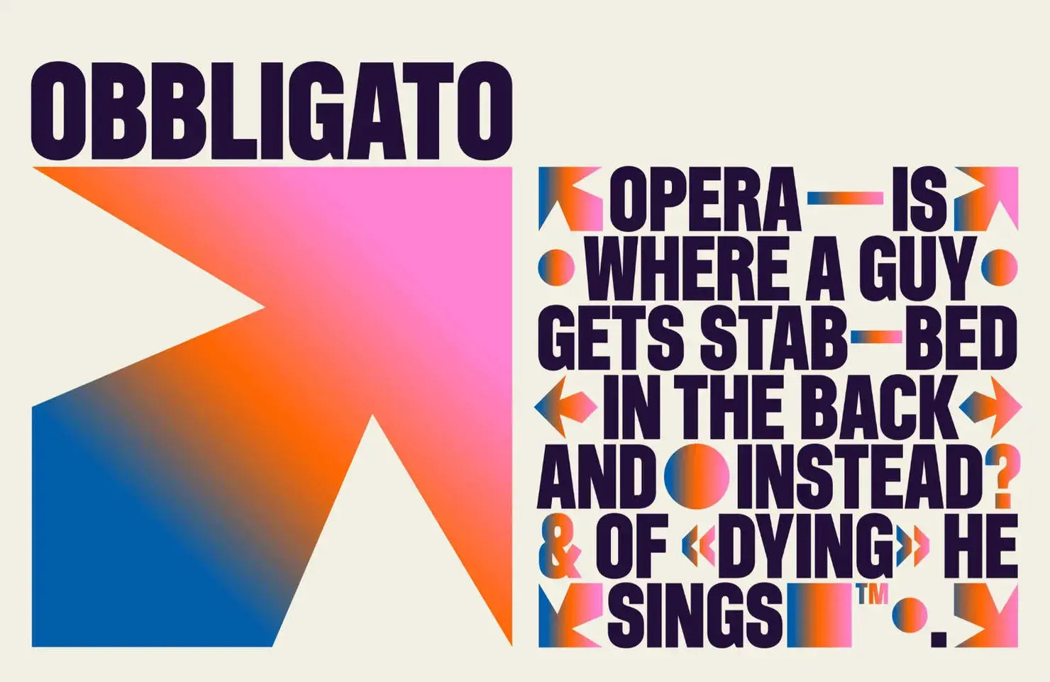
Obbligato
Based on Mortier, the typeface designed for the defunct New Your City Opera, Obbligato is bold, ambitious, and packed with positivity. It is crying out to be used in a branding project.
Family
Based on the early 20th-century typeface Clearface, Family is a highly detailed modern serif font rethought for contemporary use in demanding designs.